
 My Account
✅ Product Description
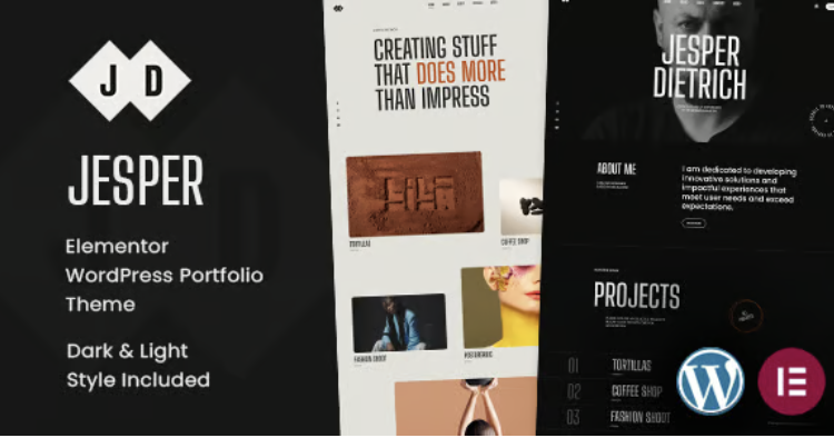
Jesper is a Responsive Elementor Portfolio WordPress Theme built to showcase creative work with crisp typography, balanced spacing, and purposeful motion. This overview-friendly theme helps you present projects, services, and credentials in a structure clients understand at a glance, making it ideal for freelancers, boutique agencies, and in-house teams that need professional polish without excess.
Layout options emphasize readable grids, clean hero areas, and image-first case pages that lead with outcomes. Sections for process, role, timeline, and tools make each project feel credible, while reusable blocks keep formatting consistent across your archive. Light micro-interactions guide attention without overshadowing the work.
Jesper – Responsive Elementor Portfolio WordPress Theme treats storytelling as a system. You can assemble narrative sequences—problem, approach, result—then save them as templates for future engagements. Media blocks support stills, reels, and device mockups with captions for accessibility. Contact panels and proposal prompts remain discoverable yet unobtrusive.
Jesper puts performance and accessibility first. Responsive breakpoints protect composition on any screen; keyboard focus and contrast rules maintain clarity; and cache-friendly markup helps pages feel quick even on mobile networks. Copy modules encourage scannable headings and pull quotes, giving your portfolio an editorial rhythm.
Responsive Elementor Portfolio WordPress Theme fundamentals extend to brand control. Tokens for color, radius, and spacing keep visuals coherent as you add pages, while icon and badge components adapt to different services—branding, product design, photography—without refactoring layouts. Global styles make seasonal refreshes straightforward.
Jesper – Responsive Elementor Portfolio WordPress Theme scales with your pipeline. Filters by industry, platform, or deliverable help prospects find relevant proof quickly. Testimonial slots and metrics boxes frame impact without hype, and lightweight forms reduce friction for inquiries and collaboration requests.
✅ Key Features
-
Visual grids with masonry and standard layouts
-
Case templates for problem–approach–result storytelling
-
Media galleries with lightbox and captions
-
Global style tokens for color, type, and spacing
-
Reusable blocks for services, FAQs, and metrics
-
Accessible focus states and legible contrast
-
Smooth, lightweight page transitions
-
Filterable archives by industry and deliverable
-
Contact and inquiry forms with inline validation
-
Performance-minded, cache-friendly structure
✅ Use Cases
Show a designer’s product case studies with measurable outcomes; present a photographer’s editorial sets with concise captions; document an agency’s rebrand projects with before/after modules and metrics; publish a developer’s app showcases with device frames and linkable notes for stakeholders.
✅ Benefits
Faster launches from reusable patterns; higher credibility through structured storytelling; better engagement via performance and accessibility; consistent brand expression at scale; simpler maintenance as your portfolio grows and client work evolves.


There are no reviews yet.