WETA Agencysp – Saas Landing Figma Template
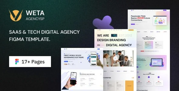
WETA Agencysp Overview & Design System Role in SaaS Delivery
WETA Agencysp is a SaaS landing Figma template engineered for product teams, software startups, and digital agencies that need structured, reviewable landing page layouts before any front-end code is written. The package resolves a recurring delivery bottleneck: converting SaaS product positioning into complete interface screens without rebuilding every page from a blank canvas. Within an agency pipeline, the file set operates as the single design authority for client presentations, developer handoff, and iteration on conversion-focused page architectures.
Technical Specifications & Deployment Matrix
| Engineering Metric | Deployment Specification |
|---|---|
| Base Technology / Framework | Figma design environment, native .FIG source files |
| Runtime / Language Requirements | Figma desktop application or browser workspace with an active account |
| Graphics Files Included | 17 Figma files covering 3 homepage demos plus 14 supporting screens |
| Front-End Dependencies | None; pure vector design layer with no code runtime attached |
| Typography & Icon Layer | DM Sans (Google Fonts); Flaticon and Feather Icon sets |
| Media Attribution Sources | Placeholder imagery sourced from Freepik, Pexels, and Pixabay |
Layer Architecture & Page Composition Pipeline
The package distributes its interface system across three independent homepage demos, each functioning as a distinct entry point into a shared 17-screen page inventory. Layer trees inside each file are grouped and named according to page region, which allows designers to isolate a hero block, pricing table, or footer module, modify it, and propagate the revision through the affected frames without disturbing unrelated screen sections. Because every screen is delivered as an editable Figma document rather than a flattened export, geometry, fill values, text styles, and component instances remain addressable at the object level throughout the customization cycle.
The page inventory covers the full SaaS conversion path: Home One, Home Two, and Home Three variants; About Us; Service and Service Details; Portfolio and Portfolio Details; Blog and Blog Details; FAQ; Testimonial; Team and Team Details; Pricing; Contact Us; and a dedicated 404 Error screen. This structure means an agency can assemble a complete multi-page client proposal from one source package instead of stitching together fragments from unrelated UI kits.
Architectural & Functional Highlights
- Three demo variants: each homepage demo presents an alternative layout logic for the same SaaS narrative, letting teams A/B test visual hierarchies at the design review stage before committing development hours.
- 17-file page coverage: standalone screens for service detail, portfolio detail, team detail, and error states remove the need to design supporting pages from scratch during scope expansion.
- Single-family typography system: DM Sans carries the entire type scale across all screens, keeping text styles consistent and simplifying font pairing decisions during rebranding passes.
- Dual icon inventories: Flaticon and Feather Icon provide both illustrative and line-weight glyph options, giving interface modules two visual registers to draw from.
- Mobile and tablet framing: screens are composed to hold their layout integrity on tablet and mobile viewports, establishing the responsive reference baseline for the development phase.
For teams whose next milestone is a browser-rendered deliverable rather than a design artifact, Pintex exists as an independent HTML implementation path for SaaS landing pages, operating outside the Figma workspace as a separate code-based solution.
Production Implementation & Operational Boundaries
Deploying the package into a live client engagement follows a predictable sequence: designers open the .FIG files in Figma, duplicate the target demo, override the DM Sans text layers with client copy, and swap the Freepik, Pexels, and Pixabay placeholder imagery for licensed brand assets. Because the graphics files are stock-sourced placeholders, production teams must verify imagery attribution requirements for each external source before final delivery; this is the primary compliance boundary documented in the package structure. The layout itself imposes no server, database, or browser requirements, since the deliverable remains a design-layer artifact until a separate front-end build translates it.
Customization scope is confined to style overriding and asset replacement: colors, typography weights, spacing, and imagery are all editable at the layer level, and the organized layer grouping keeps those edits traceable. Where an engagement demands a WordPress-rendered SaaS presence rather than a static design handoff, CodBe serves as a decoupled theme package for software landing and IT solutions sites, maintained as a separate codebase rather than an extension of the design files. Teams working across both artifacts should treat the Figma package as the visual specification and the theme as an independent implementation, with the .FIG files acting as the reference contract between the two.
Frequently Asked Questions
Does the template use a freely available font family for its typography?
Yes, the entire type system runs on DM Sans, a Google Fonts family, which means designers can activate the typeface at no cost inside Figma and developers can reference the same family during front-end implementation without font licensing overhead.
Are detail-level screens such as Service Details and Team Details included in the file package?
Yes, the 17-file inventory explicitly contains Service Details, Portfolio Details, Blog Details, and Team Details screens, so secondary navigation flows can be designed and reviewed alongside the primary homepage demos.
Can the error state screen be customized alongside the main landing pages?
Yes, a dedicated 404 Error screen ships as a standalone editable page within the package, allowing teams to align the error state with the visual language of whichever homepage demo they select.