
 My Account
 Pro feature set included (plugin or theme), ready to use immediately; no feature locks.
✅ Product Description
Thrive Theme Builder pairs closely with Shapeshift Theme to give marketers a complete site framework that ships fast and stays consistent. The visual setup wizard maps brand colors, typography, and spacing into reusable tokens, so every page inherits the same rhythm without micromanaging CSS. Headers, footers, sidebars, and post templates are organized as components you can lock, duplicate, or swap, keeping campaigns flexible while protecting the system underneath.
Thrive Theme Builder + Shapeshift Theme aligns creative speed with governance. Editors work on a live canvas that reflects real content, preview states for posts or products, and publish with confidence that layout rules hold across breakpoints. The Shapeshift Theme starter library speeds first launch with accessible patterns for hero areas, feature grids, FAQs, and footers; once live, teams refine presets rather than rebuilding sections from scratch.
Thrive Theme Builder also supports operations at scale. Role-aware permissions keep brand-critical regions safe while allowing copy and media edits where they’re intended. Template rules target archives, search, and custom post types, so category pages, resource hubs, and landing flows remain coherent as the site grows. Clean markup cooperates with caching and CDNs, and performance helpers keep pages quick even as visuals become more ambitious.
Conversion thinking is built in rather than bolted on. You can reserve zones for CTAs, testimonials, or opt-ins, schedule seasonal variations, and measure effects with analytics events tied to key components. For multilingual or regional sites, the layout respects right-to-left scripts and local date/number formats. Paired with a tidy media strategy, image ratios stay consistent, and alt text rules help content teams meet accessibility goals. Used thoughtfully, Thrive Theme Builder + Shapeshift Theme scales from a single blog to a portfolio, course hub, or lightweight store without fragmenting the brand.
Use Cases – Setup
Launch a content hub for thought leadership, rebuild service pages with consistent storytelling, or roll out a microsite for a product launch. Typical setup: define brand tokens, select header/footer variants, and pick default templates for posts, pages, and archives; save hero, pricing, and testimonial sections to the library; lock navigation and identity areas; then open safe regions for editors. Before publishing, preview responsive states, confirm contrast targets, and document naming conventions so future campaigns reuse the same building blocks.
✅ Key Features
-
Component-based headers, footers, sidebars, and post templates
-
Global tokens for color, typography, spacing, and motion cues
-
Library of reusable sections and layout presets with locks
-
Template targeting for archives, search, and custom types
-
Accessibility-minded structure, responsive previews, and clean markup
-
Friendly with common SEO, form, analytics, and caching tools
✅ Service Highlights – GPLPal
-
One-time payment with lifetime free updates
-
100% original GPL version for unlimited sites
-
Instant download, easy install, and guided setup
-
Regular sync to the latest official release
-
Friendly technical support for configuration
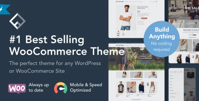
👉 More WordPress Themes
 2")


, ready to use immediately; no feature locks. ✅ Product Description Thrive Theme Builder pairs closely with Shapeshift Theme to give marketers a complete site framework that ships fast and stays consistent. The visual setup wizard maps brand colors, typography, and spacing into reusable tokens, so every page inherits […])
NeonHollow
Dashboards show truth, not vanity graphing.