Setu – NFT Marketplace with Admin Dashboards
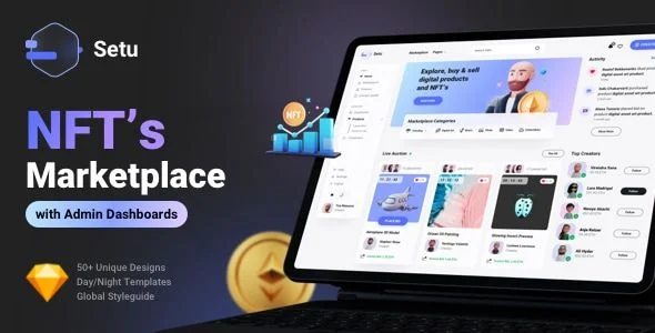
Setu NFT Marketplace Overview & Design System Architecture
Setu NFT Marketplace is a Sketch UI kit engineered for product designers and agencies to accelerate the design of NFT and digital-product trading platforms where users buy, sell, and auction assets. The package eliminates the repetitive work of building marketplace screens from scratch by supplying pre-structured layouts, reusable component symbols, and a global styleguide that governs every artboard, covering both the buyer-facing storefront and the internal admin dashboards with reporting views. Within agency delivery pipelines, it functions as a production-phase design foundation: teams mix the supplied layouts and components to assemble high-resolution mockups quickly, then propagate branding changes across the entire document through centrally defined color and typography styles.
Technical Specifications & Deployment Matrix
| Engineering Metric | Deployment Specification |
|---|---|
| Base Technology / Framework | Sketch application source file (.sketch) |
| Layout System | 12-column grid structure with 8pt spacing rules |
| Typography Engine | Google Fonts – Roboto family, managed as global text styles |
| Theming Model | Global color styles; separate light and dark template editions |
| Component Inventory | 100+ reusable components, 50+ unique screen layouts |
| Runtime / Backend Footprint | None – static design deliverable; no executable code or database layer |
Component Architecture & Marketplace Screen Pipeline
The core mechanism is a symbol-driven component system: every card, modal, navigation block, and data widget is defined once and instantiated across all 50+ screens. Because instances inherit their visual properties from shared layer styles and text styles, a modification to a master component or a global color token propagates downstream to every artboard that references it. This propagation model is what allows the light and dark editions to remain synchronized during iteration, since both themes are driven from the same central style definitions rather than per-screen overrides.
The screen inventory follows the complete transactional lifecycle of an NFT marketplace. Designers get homepage variants, product detail options, a marketplace explore view with filter states, profile and creator space layouts, wallet connection screens, buy and bid modal flows, and authentication screens. Supplementary pages cover blog layouts plus utility states such as contact, FAQ, 404, and maintenance. On the operations side, the kit ships admin dashboards and reporting screens, meaning the same document can carry both the customer journey and the internal analytics surface without rebuilding the visual language.
Core Technical Capabilities of Setu NFT Marketplace
- Global Style Propagation: Colors and typography are defined as document-level shared styles, so a single edit re-skins every screen in one operation instead of requiring artboard-by-artboard adjustments.
- Symbol-Based Component Reuse: The 100+ component set is structured as reusable symbols with overrides, letting designers swap imagery, labels, and pricing data inside instances without detaching or breaking the master definitions.
- 8pt Grid Discipline: All spacing and sizing decisions conform to an 8pt baseline paired with 12-column grids, which keeps layouts predictable and shortens developer handoff during conversion to production front-ends.
- Dual-Theme Coverage: Both light and dark editions are included, so teams can validate contrast and readability for each marketplace state without authoring a second design pass.
- Full Product Lifecycle Screens: Buyer flows (explore, filter, bid, purchase) and operator flows (dashboards, reporting) coexist in one document, closing the gap between storefront mockups and internal tooling design.
Production Implementation & Operational Resilience
Because the deliverable is a Sketch source document rather than runtime software, the operational boundaries are set by the design environment. The file requires Sketch, which runs on macOS, so mixed-platform teams need to plan handoff exports or browser-based preview workflows for collaborators on other operating systems. The document is organized with documentation notes and an icons and components sheet, which functions as an internal styleguide reference — new team members can locate the approved component before drawing anything custom, reducing drift from the established system.
Customization operates entirely within the style layer. Rebranding is executed by redefining the global color styles and swapping the Roboto text styles for another typeface, after which all dependent screens update automatically. Asset replacement is the second boundary to plan for: the images displayed in the preview compositions are sourced from Envato Elements, Unsplash, Pixabay, Iconfinder, and Ui8, and they are not bundled with the download. Every image layer must therefore be treated as a placeholder slot and refilled with licensed assets before client presentation or production handoff.
For teams whose project scope moves beyond static design into a coded React front-end for the admin and analytics surfaces, DashLite – React Admin Dashboard Template exists as a separate, code-level alternative outside the Sketch environment. Similarly, when a broader SaaS dashboard implementation is required as an independent production path, Modernize Multipurpose Admin Dashboard Template serves that role as a standalone deliverable. Neither asset shares a runtime with this design kit, and each should be evaluated against its own stack requirements.
Frequently Asked Questions
Are the preview images and graphics included in the downloaded source file?
No. All imagery shown in the preview compositions is used for display purposes only and is sourced from external stock libraries. The download package contains the Sketch source file, and every image layer must be replaced with separately licensed assets.
Can brand colors and fonts be changed across all screens in a single operation?
Yes. The document uses global color styles and global typography built on the Roboto Google Fonts family. Redefining these shared styles updates every dependent screen at once, which is the intended mechanism for applying client branding.
Does the kit include functional wallet, bidding, or auction logic?
No. The package is a static Sketch design system containing layouts, symbols, and modal screens for wallet connections, buying, and bidding. It contains no executable code, no API layer, and no runtime transaction engine; production logic requires separate development.