Opta – Minimal Portfolio and Photography WordPress Theme
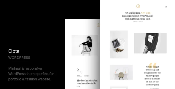
Opta Overview & Minimalist Portfolio Rendering Architecture
Opta is a minimal portfolio and photography WordPress theme engineered for photographers, visual artists, and writers who need image-first presentation built on the standard WordPress template stack. The package targets a recurring bottleneck in media-heavy builds — galleries, sliders, and editorial copy competing for layout attention — and resolves it through a restrained typographic system, a 4-plus column presentation grid, and dedicated Portfolio and Gallery post types that isolate visual archives from the blog feed. Within production and agency workflows it operates as a self-hosted front-end layer that renders consistently across Firefox, Safari, Opera, Chrome, and Edge.
Technical Specifications & Deployment Matrix
| Engineering Metric | Deployment Specification |
|---|---|
| Base Technology / Framework | WordPress theme package (v1.9) shipping PHP, CSS, and JS source files |
| Runtime / Language Requirements | WordPress 7.0.x on a standard PHP/MySQL hosting stack |
| Data Exchange / Communication Protocols | Native WordPress request/response cycle; no external API dependency |
| Front-End / Engine Dependencies | Google Web Fonts, image slider, text slider, gallery carousel, shortcode generator |
| Database / Persistence Footprint | Native WordPress schema; translated content persisted via WPML or Polylang |
Custom Post Type Pipeline & Gallery Rendering Flow
Opta routes visual presentation through two registered custom post types — Portfolio and Gallery — that decouple image archives from the native post stream. When a visitor requests a portfolio entry, WordPress parses the URL against its template hierarchy, selects the matching PHP template, queries the attached media, and emits a responsive DOM tree whose multi-column grid reflows to any screen width. Editors never touch template files directly: the bundled shortcode generator exposes the image slider, text slider, and gallery carousel as inline tokens embeddable inside any page body.
Typography loads through the Google Web Fonts pipeline, keeping rendered text aligned with the theme’s restrained design language. Because the attribute sheet lists Gutenberg optimization as absent, content assembly follows the classic editor plus shortcode workflow rather than native block controls. For studios evaluating standalone alternatives outside this image-grid pipeline, Oyster operates as an independent photography-oriented WordPress theme carrying its own gallery architecture.
Architectural & Functional Highlights
- Portfolio and Gallery post types: Separate registrations keep image archives out of the blog loop, letting the main feed carry editorial content while portfolio queries target the dedicated post type records inside the native WordPress schema.
- Shortcode generator: A token parser converts shortcodes into slider, carousel, and gallery markup at render time, so media components drop into any page without template file edits.
- Multilingual routing: A bundled .POT catalog plus Loco Translate compatibility feeds WPML and Polylang, which persist translated strings and duplicated post records within the standard database schema.
- Responsive grid engine: CSS-driven column layout adapts the 4-plus column presentation to phone, tablet, and desktop viewports without maintaining separate mobile templates.
- Widget-ready regions: Sidebar and footer areas register through the native widget API, accepting any WordPress widget instance for auxiliary navigation or content placement.
Production Implementation & Operational Resilience
Deployment follows the standard theme installation path: upload the package, activate it in the WordPress dashboard, then import the bundled XML demo content file through the core importer to reproduce the reference page structure. Because the distribution ships image placeholders rather than the licensed demo photography, teams must source production media before client go-live — a boundary that shapes staging timelines on delivery projects. Form handling delegates to Contact Form 7, whose shortcode output renders directly inside the theme templates, while social sharing routes through AddToAny instead of custom share scripts, keeping the JavaScript surface small and predictable.
Browser coverage is verified against Firefox, Safari, Opera, Chrome, and Edge, which constrains the stylesheet to properties that render identically across all five engines. The package includes readable PHP, CSS, and JS source files, so style adjustments happen at the stylesheet level and structural changes stay within template overrides, widget configuration, and shortcode placement — no page builder dependency exists in this architecture. Translation work runs through Loco Translate against the .POT catalog, generating .po and .mo files without code modification. For writers whose deliverable is editorial rather than visual, East exists as a separate minimal blog theme outside this portfolio pipeline.
Frequently Asked Questions
Does the Opta package include the photography images shown in the demo?
No. The distribution ships image placeholders instead of the demo photography, since those images carry third-party licensing restrictions. Each placeholder preserves the intended dimensions and grid positions, so imported layouts retain their structure until production media replaces them.
Is Opta optimized for the Gutenberg block editor?
No. The theme’s attribute sheet lists Gutenberg optimization as absent, meaning content assembly relies on the classic editor workflow together with the bundled shortcode generator for sliders, carousels, and gallery components rather than native block controls.
Can an XML demo content file reproduce the reference site structure?
Yes. The package includes an XML demo content file that the standard WordPress importer consumes to populate posts, pages, and custom post type entries, reproducing the demo layout skeleton so teams can overwrite placeholder content with client media.