Fresh Food – Organic Food/Fruit/Vegetables eCommerce HTML Template
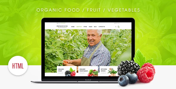
Fresh Food Organic eCommerce HTML Template Overview & Static Storefront Foundation
Fresh Food Organic eCommerce HTML Template is a static HTML5, CSS3, and JavaScript front-end package built on the Bootstrap framework, engineered for agencies and store owners launching organic food, fruit, or vegetable storefronts. The package eliminates the markup-construction bottleneck of e-commerce design by supplying pre-built shop pages, grid and masonry product layouts, sidebar variants, megamenu navigation, and touch-enabled carousel modules as deployable HTML, CSS, and JS files. Within an agency delivery pipeline, it operates as the presentation layer that can be hosted on any static web server and later wired to a commerce backend of the developer’s choosing.
Technical Specifications & Deployment Matrix
| Engineering Metric | Deployment Specification |
|---|---|
| Base Technology / Framework | HTML5 / CSS3 markup on Bootstrap 4.x and Bootstrap 5.x grid and component conventions |
| Runtime / Language Requirements | Static hosting only; HTML, CSS, and jQuery-based JavaScript execution in the browser |
| Data Exchange / Communication Protocols | Client-side HTTP delivery of static assets; no server-side request routing |
| Front-End / Engine Dependencies | jQuery content scroller, banner slider engine, font icon libraries, styled Google Maps embedding |
| Database / Persistence Footprint | None; the codebase ships as static files with zero database or backend persistence layer |
| Browser Compatibility Matrix | IE9, IE10, IE11, Firefox, Safari, Opera, Chrome, and Edge |
| Resolution & Layout | Responsive layout adapting to any viewport; high-resolution retina-ready graphics |
Static Rendering Engine & Front-End Execution Pipeline
The core mechanism is a pure browser-side rendering pipeline: the server returns flat HTML documents, and layout, navigation state, and carousel behavior are assembled client-side from the shipped CSS and JS assets. Because no PHP interpreter, database engine, or application server participates in the request cycle, page delivery reduces to standard HTTP asset transfer, which keeps the deployment surface minimal and hosting requirements generic. On load, the Bootstrap grid system positions the shop, category, and product blocks across the configured breakpoints, while the jQuery carousel plugin initializes its touch-navigation scroller for both desktop pointer input and mobile gesture input. The banner slider module dispatches its animation sequence during initial paint, and the megamenu module binds hover and click events to category panels so that large product taxonomies remain navigable without additional page loads. Product grids support grid and masonry modes with optional sidebar layouts, letting a developer switch presentation patterns by swapping markup blocks rather than rewriting layout logic. Styling for maps is handled through an embedded Google Maps configuration with styling support, rendered directly into the contact and location sections. For teams that need a hosted, platform-managed organic storefront instead of static markup, Vegeda exists as a separate Shopify-based alternative within the same organic commerce vertical.
Architectural & Functional Highlights
- Retina-Ready Graphics Pipeline: Image and icon assets ship at resolutions calibrated for high-density displays, so the rendered output maintains pixel accuracy on retina screens without conditional stylesheet forks.
- Bootstrap Grid with Multi-Breakpoint Adaptation: Layout regions reflow through the framework’s responsive breakpoints, allowing the same markup to serve mobile, tablet, and desktop viewports from a single document.
- Touch-Enabled jQuery Carousel: The product scroller registers touch navigation events for mobile alongside pointer events for desktop, giving the shop modules gesture-driven scrolling without a framework migration.
- Megamenu Navigation Architecture: Category and page links organize into multi-column dropdown panels, which supports large catalogs with many categories while remaining pure HTML, CSS, and JS.
- SEO-Oriented Semantic Markup: Document structure follows established SEO practices, with semantic headings and crawlable content ordering that search engines can index directly from the static HTML output.
Production Implementation & Operational Resilience
Deployment requires only a static file host: the developer uploads the HTML, CSS, and JS directories, and every page becomes reachable without build steps, runtime compilation, or server configuration beyond MIME-type handling. Customization boundaries are defined by the static architecture itself. Visual changes are applied by overriding the shipped CSS rules or editing the stylesheets directly; structural changes require editing the corresponding HTML documents, since no template engine or partial-inclusion layer performs server-side composition. Behavior adjustments, such as carousel timing or slider configuration, live in the JavaScript files and can be modified without touching markup. One operational boundary deserves attention during staging: all imagery in the demo is used for preview purposes only and is not included in the final purchase files, so a production rollout must source and swap its own photography before client handoff. The styled Google Maps embedding loads its tiles from an external script, which means offline staging environments will render the map container without map data unless outbound connectivity is available. Legacy-browser resilience is addressed through the IE9-through-IE11 compatibility layer, which permits delivery to client bases still operating older browsers alongside current versions of Chrome, Firefox, Safari, Opera, and Edge. For campaign work where the storefront needs an accompanying product-promotion page, KNOX functions as an independent static landing-page package on the same pure-HTML delivery model.
Frequently Asked Questions
Are the demo images included in the purchased download package?
No, all images shown in the live preview are used for demonstration purposes only and are excluded from the final purchase files, so developers must supply their own store photography and product visuals before deployment.
Does this package require a database or server-side language to run?
No, the deliverables consist of HTML files, CSS files, and JS files, meaning the template runs entirely in the browser on any static host without a database, PHP runtime, or backend application server.
Can the layout render correctly in Internet Explorer 9?
Yes, the template is engineered for multi-browser compatibility spanning IE9, IE10, and IE11, in addition to current versions of Chrome, Firefox, Safari, Opera, and Edge.