
 My Account
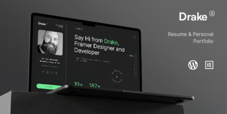
✅ Product Description
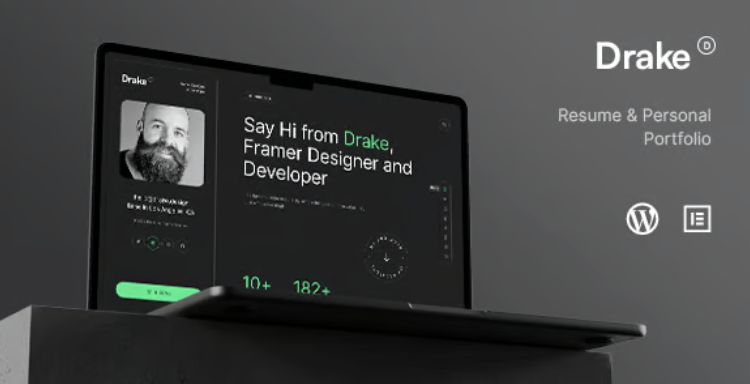
Drake Portfolio Theme is a Personal Portfolio WordPress Theme designed for designers, developers, photographers, and indie makers who need a crisp, conversion-minded site. The opening hero clarifies your value, surfaces social links, and routes visitors to case studies or contact without friction. Balanced spacing, readable type scales, and image-first sections keep attention on work quality while guiding the next step.
Drake – Personal Portfolio WordPress Theme frames projects like narratives—problem, role, process, and outcomes—so clients can scan impact quickly. You can group deliverables, embed responsive media, and add concise captions that explain decisions without bloating the page. Subtle motion and measured hover states provide orientation, not distraction, preserving a calm reading rhythm across devices.
A Personal Portfolio WordPress Theme should make editing effortless. Reusable sections handle hero intros, services, testimonials, and FAQs, so updates stay consistent as your body of work grows. Smart link paths connect highlights on the homepage to deeper case details, while contact routes remain visible but never pushy—perfect for inbound leads who skim first and decide later.
In the middle of a busy season, Drake Portfolio Theme helps you publish fast: duplicate a case scaffold, drop in assets, and adjust headlines to match the client’s language. Global tokens keep color, type, and spacing aligned, reducing design drift between pages. Performance-minded choices—responsive images, lazy loading, and stable layout behavior—protect perceived speed for recruiters browsing on mobile.
For credibility, Drake – Personal Portfolio WordPress Theme places proof where it matters. Pair metrics with short context lines, attribute logos with clear roles, and keep quotes concise so they read like signals, not fluff. Accessibly structured headings, sensible focus order, and generous tap targets ensure comfort for everyone, including screen-reader users.
If your practice spans services—branding, UI, 3D, or web builds—the layout scales without clutter. Service overviews speak in outcomes, while pricing cues remain lightweight and optional. Newsletter blocks and lightweight lead magnets integrate cleanly for creators building an audience alongside client work, without derailing the case-study path.
✅ Key Features
-
Case-study scaffolds with problem → role → process → result flow
-
Modular sections for services, testimonials, FAQs, and contact
-
Media galleries with captions and responsive embeds
-
Global design tokens for color, type scale, and spacing
-
SEO-friendly headings and structured content areas
-
Performance-aware image handling and stable layout behavior
-
Accessibility-minded contrast, focus order, and keyboard support
-
Lightweight blog/notes layout for in-public building
-
Social link hub and simple contact routes
-
Translation-ready with RTL support
✅ Use Cases
Freelancers can showcase three flagship projects with concise outcomes and a direct inquiry path. Studios can split work by vertical—SaaS, e-commerce, or culture—while keeping a unified voice. Educators or speakers can add a talk archive and resources page that reuse the same reading rhythm as case studies.
✅ Benefits
You publish faster, keep visuals coherent, and communicate value with fewer clicks. Visitors experience clarity, proof, and predictable navigation—raising confidence to inquire, subscribe, or book a call—while your site scales from a single portfolio to a compact studio presence without redesign.


There are no reviews yet.