Cleanest – Mobile Template
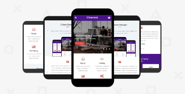
Cleanest Mobile Template Overview & Mobile-First Front-End Architecture
Cleanest Mobile Template is an HTML5, CSS3, JavaScript, and PHP front-end package, engineered for agencies and independent developers who need a phone-optimized presentation layer across creative, portfolio, shop, and blog projects. The package removes the bottleneck of hand-building mobile viewport layouts by supplying prebuilt section components that adapt across a documented six-browser compatibility matrix. Within production delivery workflows, it operates as a self-hosted source deliverable: markup and styles are edited directly, the included PHP handler processes contact submissions on a mail-capable server, and the finished files deploy to any standard web host.
Technical Specifications & Deployment Matrix
| Engineering Metric | Deployment Specification |
|---|---|
| Base Technology / Framework | Static HTML5 document set with external CSS and JavaScript layers, plus a PHP form handler |
| Runtime / Language Requirements | Any static web host; PHP execution required only for contact form processing |
| Data Exchange / Communication Protocols | Standard HTTP form POST dispatched to the included server-side handler |
| Front-End / Engine Dependencies | Font Awesome icon library; vanilla JavaScript for interface behavior |
| Database / Persistence Footprint | None — flat-file architecture with no database or persistence layer |
Static Section Composition & Rendering Pipeline
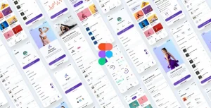
The template renders through a document-driven pipeline: the browser requests an HTML file, parses the linked stylesheets and scripts, and paints each prebuilt section — home, service, portfolio, shop, blog, and contact — from semantic HTML5 markup. Because every page is a standalone document, layout logic is concentrated in the CSS layer, while interaction behavior is isolated in the JavaScript files, keeping rendering concerns separated from content. The responsive grid recalculates column widths at each viewport breakpoint, so a single source document serves phones and tablets without maintaining parallel markup trees. The flat, material-influenced purple palette is defined at the stylesheet level, which means color and typography decisions propagate sitewide from one location rather than requiring per-page edits. Portfolio grids, shop product blocks, and blog post listings inherit this same responsive scaffolding, letting teams reuse one structural pattern across every content vertical the package targets. For presentation-heavy projects demanding a broader desktop canvas, Photogen exists as an independent static alternative outside this mobile-first layout, oriented toward photography portfolios rather than phone-native browsing.
Architectural & Functional Highlights
- Multipurpose section library: Prebuilt home, about, service, portfolio, shop, blog, and contact documents share one responsive stylesheet, so a single deployment can serve multiple niches without restructuring markup.
- Server-side contact handling: The contact section dispatches an HTTP POST to the bundled PHP file, which processes submitted fields and routes the message through the host mail function — no external form service is required.
- Font Awesome icon layer: Iconography ships inside the delivered assets, so interface glyphs render from local font files rather than third-party CDNs, reducing external requests on constrained mobile networks.
- Direct-source customization: Because the package contains raw PHP, HTML, CSS, and JS files with no compilation step, developers restyle the theme by editing stylesheets and swap sections by copying document blocks.
- Cross-browser layout stability: The compatibility matrix spans IE11 through Edge, requiring CSS patterns that degrade predictably in legacy engines while remaining fully fluid in modern browsers.
Production Implementation & Operational Resilience
Deployment follows a flat-file model: upload the document set to any web server and the site renders immediately, with no install routine, no dependency resolution, and no database provisioning. The single environmental prerequisite is PHP availability wherever the contact form must function; on hosts where the mail function is disabled or rate-limited, submissions will not dispatch, so teams should verify mail transport behavior on the target server before client handover. Styling changes are confined to the CSS files, where the purple, flat, and material-influenced palette is defined; overriding colors, spacing, or typography at that layer propagates across every section without touching individual documents. Demo imagery and copy live directly in the HTML files, so content replacement is a per-document edit rather than a configuration task. High-resolution asset support means photography-heavy variants can ship at full quality, though teams should compress media before deployment to protect load budgets on cellular connections. For wellness-sector studios weighing a separate standalone path, Makeover provides a spa-oriented responsive HTML5 template as a parallel static option rather than an extension of this codebase.
Frequently Asked Questions
Is Internet Explorer 11 fully covered by the browser compatibility matrix?
Yes, Internet Explorer 11 appears in the documented compatibility set alongside Firefox, Safari, Opera, Chrome, and Edge, so the stylesheets are structured to hold layout integrity across both legacy and modern rendering engines.
Can the contact form be tested by opening the files directly in a browser?
No, the contact handler depends on server-side PHP execution, so opening files locally in a browser cannot exercise form submission; a PHP-enabled server environment is required to validate the dispatch path before deployment.
Does the source package include written documentation covering the setup sequence?
Yes, the deliverable ships with written documentation covering file structure and the setup sequence, which reduces onboarding friction when the source is transferred between developers during an agency cycle or handed to a maintenance team.