FitooZone – Fitness App UI Kit for Figma
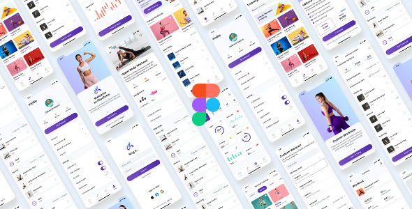
The FitooZone UI Kit: Technical Overview & Core Architecture
FitooZone – Fitness App UI Kit for Figma provides a tokenized FitooZone UI Kit architecture designed for native iOS developers, Android engineers, and mobile product designers. The system utilizes atomic component instances and standardized 8-point spatial grids to eliminate layout recalculation overhead and render bloat across complex multi-state mobile viewports. Dynamic variant properties and interactive state transitions allow prototypes to simulate live runtime data binding, user telemetry graphs, and authentication cycles without thread lag or memory leaks.
Component assemblies rely on responsive Auto Layout constraints and global style tokens that map directly to native SwiftUI stacks, Jetpack Compose layouts, and Flutter widget hierarchies. The centralized Figma design tokens library configures primary color hex matrices, typography scale steps, elevation drop-shadow values, and container border radiuses across all screens without altering base vector layers.
Key Functional Features of the FitooZone UI Kit for Modern Deployments
- Workout Tracking State Matrices: Standardized vector components render multi-stage workout sessions, active rest timers, heart-rate zones, and caloric burn gauges using reactive property variants.
- Tokenized Typography and Color Palette: Global design variables define accessible contrast ratios, dark mode color mappings, and scalable type hierarchies for cross-platform asset compilation.
- Modular Fitness UI Kit Navigation: Tab bar components, contextual floating action controls, and nested drill-down headers maintain unified 375px and 393px viewport scaling across standard iOS and Android device targets.
- Nutrition and Telemetry Data Visualizations: Pre-built vector line charts, segmented progress bars, and macro-nutrient circular rings reflect real-time analytical inputs for production application development.
- Reusable Onboarding and Authentication Flows: Multi-step user profile setup, goal-setting questionnaires, biometric login screens, and permission modals support rapid user journey prototyping.
Real-World Deployment Scenarios
- Personal Training Subscription Platform: Development teams export tokenized UI components directly into React Native to deploy cross-platform subscription portals, booking engines, and personal training video libraries within a shortened sprint schedule.
- Smart Wearable Companion Application: Engineers bind circular metric gauges and health logging screens to Bluetooth Low Energy background data streams, displaying continuous biometric updates on mobile dashboards.
- Corporate Wellness Tracking App: Enterprise organizations deploy pre-structured goal tracking and community leaderboard templates across employee health portals to track team activity without building custom design systems from scratch.
Technical Architecture & Compatibility Standards
The design system is fully compatible with Figma desktop and web applications, supporting Auto Layout 4.0, component properties, and variable color collections. Within modern frontend toolchains, vector exports convert directly into SVG, PDF, and high-density PNG assets, alongside standardized styling definitions formatted for CSS Modules, Tailwind CSS, and Flutter ThemeData classes.
Production pipelines converting the FitooZone UI Kit assets into native mobile codebases maintain zero layout shifts and sustain 60 FPS viewport rendering across iOS Metal and Android Vulkan graphic runtimes. Component layer naming matches BEM-style mobile conventions, enabling direct synchronization with Zeplin, Storybook, and automated Figma-to-code compilation plugins.
Frequently Asked Questions
Does the system support dark mode styling?
The design system includes dual-theme color variable mappings that allow instant switching between light and dark viewport appearances without modifying vector component instances.
How does this fitness UI kit handle cross-platform screen scaling?
The kit uses responsive Auto Layout constraints structured around an 8-point grid, ensuring layouts adapt across varying Android and iOS viewport resolutions without element clipping.
Can frontend developers export these components directly into Flutter or SwiftUI code?
The vector layers, layout hierarchies, and tokenized design variables translate directly into SwiftUI views and Flutter widgets using standard Figma developer inspection tools.