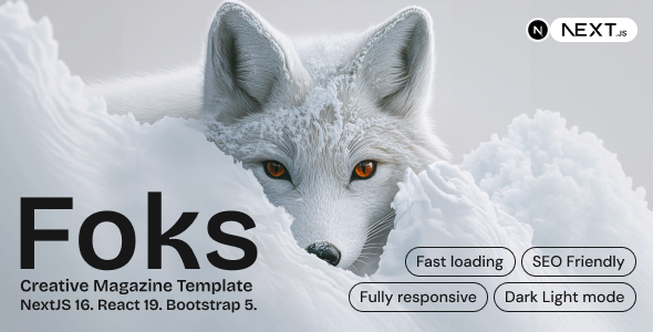
Foks – Lightweight Magazine Blog NextJS template
Architectural Analysis & Runtime Mechanics of Foks
Foks – Lightweight Magazine Blog NextJS template provides a NextJS magazine template engineered for digital journalists, independent editors, and frontend engineers to deploy high-velocity editorial portals. The component hierarchy minimizes DOM nesting by rendering articles via server-side React components and flat Bootstrap grid containers, preventing unnecessary client bundle bloat and eliminating layout recalculations. Asynchronous data hydration leverages Next.js static generation with incremental revalidation, streaming serialized Markdown or headless CMS payloads into presentation views without blocking client-side main thread operations.
Modular component blocks interface through TypeScript interfaces and decoupled React hooks, enabling developers to connect external headless CMS REST endpoints or GraphQL queries directly to pre-structured article layouts. A centralized site configuration module governs global site metadata parameters, navigation menu arrays, social sharing endpoint toggles, and article pagination thresholds without requiring edits to core rendering logic.
Core Engineering Capabilities & Features in Foks
- Hybrid Server-Side Article Pre-Rendering: The layout framework renders article routes using Next.js static generation, serving pre-compiled HTML and minimal client JavaScript to achieve instant initial paint times.
- Faceted Category Taxonomy Filtering: Client-side category selectors evaluate post metadata using memoized React state, updating displayed article cards and query parameters without triggering full browser roundtrips.
- Zero-Layout-Shift Media Optimization: Image wrappers utilize next/image containers with explicit aspect-ratio constraints and responsive srcsets, eliminating cumulative layout shifts during dynamic editorial loading.
- Modular Typography and Layout Themes: Bootstrap 5 utility layers and scoped SCSS modules isolate editorial typography, author biography cards, and reading time calculators into independent components.
Practical Production Implementations
- High-Traffic Investigative Journalism Outlets: Independent investigative editorial teams deploy the static build across edge delivery networks, handling sudden traffic spikes from viral news releases with steady sub-second load times.
- Multi-Author Technology Blog Portals: Enterprise engineering teams implement the template connected to headless CMS backends, streamlining editorial authoring pipelines across distinct technical categories.
- Curated Niche Lifestyle Magazines: Digital culture publishers deploy the responsive article templates to deliver clean reading viewports across mobile devices and desktop screens without third-party script latency.
Runtime Specifications & Environment Compatibility
Foks compiles under Node.js 18.x and 20.x LTS runtimes, utilizing the Next.js 14 and 15 App Router frameworks alongside React 19 and TypeScript 5. The codebase outputs fully static HTML and optimized JavaScript chunks during build execution, achieving Largest Contentful Paint benchmarks under 1.0 second and registering a zero Cumulative Layout Shift score across standardized Lighthouse audits.
The production bundle delivers cross-browser rendering parity across modern Blink, WebKit, and Gecko browser engines while maintaining full compatibility with static hosting providers like Vercel, Netlify, Cloudflare Pages, and AWS Amplify. Operating as a decoupled NextJS magazine template, the architecture communicates seamlessly with headless platforms including Strapi, Sanity, Ghost, and custom RESTful backends.
Frequently Asked Questions
Does the template require an active Node.js server in production?
No, the template compiles into completely static HTML, CSS, and client JavaScript bundles during build time, allowing deployment directly to static hosting providers or Amazon S3 buckets without active Node.js servers.
How does the codebase integrate with external headless CMS platforms?
Standardized TypeScript interfaces map remote JSON schema data from headless CMS endpoints directly into article card components, allowing developers to query content via native asynchronous fetch requests inside static server components.
Can developers customize the global editorial typography and color schemes?
Yes, global variables defined in the primary SCSS configuration file control root color palettes, typography font families, and container gutter widths, updating the entire presentation layout uniformly across all views.
How does image rendering prevent layout shifts on high-resolution displays?
The next/image framework enforces predetermined aspect ratio containers and serves responsive WebP formats dynamically, allocating layout dimensions before asset transmission begins to completely eliminate cumulative layout shift across mobile viewports.
Can new article listing layouts be constructed without rewriting routing logic?
Yes, modular layout components decouple presentation grids from routing controllers, enabling engineers to reorder featured carousels, sidebar widgets, and article feeds simply by passing different props into existing page components cleanly.
-
1.0.0 LatestSeptember 23, 2026