
 My Account
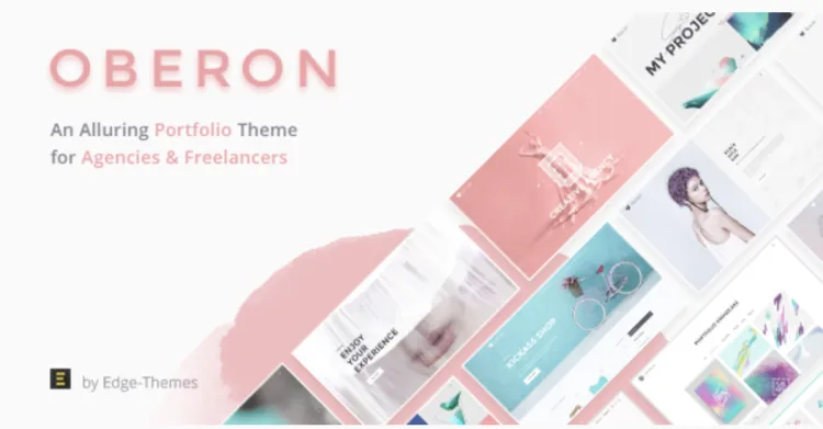
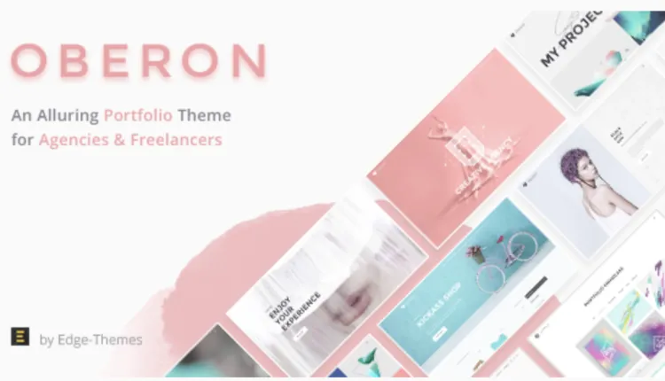
Product Overview
Oberon operates as a standalone Freelancer Portfolio WordPress Theme built for independent designers and developers who need to present case studies and capture client leads. When installed, the Oberon – Freelancer Portfolio WordPress Theme replaces the default site structure with a grid-focused layout tailored for individual creatives. It relies on a visual page builder to handle frontend layout rendering, meaning users drag structural elements onto the canvas instead of writing PHP templates. This frontend architecture focuses on heavy media support, allowing users to upload large project screenshots that automatically scale into masonry grids depending on the visitor’s screen width. The header area removes complex dropdowns in favor of a clean, single-row navigation bar that keeps the visual focus entirely on the portfolio content below.
The theme integrates directly with standard custom post types to separate portfolio items from standard blog posts. Visitors navigating the homepage encounter a sticky sidebar containing contact links that remains visible while the main content column scrolls vertically. Hovering over a project thumbnail triggers a dark overlay displaying the project title and categories, pushing the user to click into a detailed single-project view. Inside the single project layout, the featured image stretches across the top of the viewport, followed by a flexible text area where freelancers can document their specific role, project timeline, and the client’s final deliverables. A fixed floating button follows the user on desktop screens, ensuring the contact call-to-action remains available during scrolling.
Highlights & Value
Activating this Freelancer Portfolio WordPress Theme restructures how visitors interact with your uploaded media files and gallery blocks. The backend settings panel removes bloated features found in multipurpose templates, isolating only the typography and layout controls relevant to personal branding.
- Project Navigation: Single portfolio pages include previous and next arrows anchored to the bottom corners, keeping users inside the work gallery without forcing them back to the main index. The transition between these projects occurs immediately, keeping the browser window anchored to the top of the new content.
- Filterable Galleries: The main index utilizes a top row of category tabs where clicking a tag instantly reshuffles the visible thumbnails via CSS transitions rather than reloading the entire page. The grid automatically calculates the remaining blank space and repositions the remaining tiles upward to close any gaps.
- Contact Modals: Clicking the primary hire button triggers a slide-out contact form from the right edge, preventing the user from losing their place on the current reading layout. Once the form is submitted, the panel automatically retracts and displays a success message inline.
Real-World Use Cases
Oberon adapts its column structures to fit different independent service models and display requirements. Whether displaying visual design assets or written case studies, the container widths automatically restrict text lines to readable lengths.
- UI/UX Designers: Uploading wide desktop mockups that automatically break into full-width display sections below the project description blocks. The image containers support high-DPI retina uploads without stretching the pixel borders.
- Copywriters: Using text-heavy masonry layouts that rely on clean typography and background color blocks instead of large featured images to summarize articles. Pull quotes and heading styles use high-contrast formatting to break up long reading blocks.
- Web Developers: Embedding live staging links alongside technical parameter lists within the single project sidebar to prove actual coding capabilities. The sidebar tracks along the screen as users scroll through long repository readmes or code snippets.
Technical & Compatibility
Deploying the Oberon – Freelancer Portfolio WordPress Theme requires a standard WordPress 6.0 environment and avoids overriding core media handling functions. It uses native widgets for the footer area, allowing you to drag in recent post lists or newsletter subscription forms from the standard appearance menu. The CSS stylesheets avoid hardcoded colors, utilizing global site settings so that changing the primary accent color applies universally to all buttons, active link states, and form focus borders.
Image lazy loading is enabled out of the box for the portfolio grids, ensuring that pages with dozens of high-resolution thumbnails do not delay the initial text rendering in the browser. The codebase avoids loading heavy third-party animation libraries, relying instead on native CSS keyframes for the hover states to maintain high performance scores. The entire layout framework targets mobile-first loading, ensuring the CSS grid collapses into single columns efficiently on smartphone screens.
FAQ & Tips
How does the menu behave on mobile devices? The standard horizontal desktop navigation collapses into a classic hamburger icon at viewport widths below 768px. Tapping the icon pushes the menu down from the top header bar, shifting the rest of the page content downward rather than overlapping it with a fixed modal. The mobile menu links feature expanded hit areas to accommodate touch interactions comfortably.
Can I sell digital products directly from the portfolio pages? Yes, the theme includes structural support for WooCommerce integration natively. If activated, you can append checkout buttons below your case studies to sell downloadable assets, premium templates, or fixed-price consultation packages directly. The shopping cart icon automatically embeds itself into the main navigation bar once the commerce plugin activates.


PhantomCrown
Price feels fair for the time we saved.
DarkStorm
Color and type tokens are reusable.