
 My Account
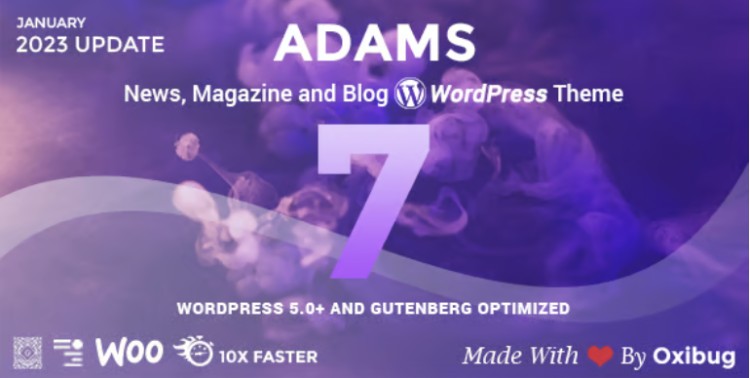
✅ Product Description
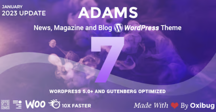
Adams is a refined editorial theme built for digital magazines, newspapers, and creator-led blogs seeking clean presentation and dependable performance. Within the first glance, its layout feels familiar to readers while remaining flexible for teams of all sizes using Responsive Retina WordPress News, Magazine, Blog patterns to scale from a personal column to a full multi-section publication. You get thoughtful typography, balanced white space, and accessible color contrast so long reads feel effortless on phones, tablets, and desktops.
Adams – Responsive Retina WordPress News, Magazine, Blog emphasizes editorial hierarchy: featured stories, curated categories, and trending blocks are arranged to surface what matters most. The homepage grid adapts to image-heavy or text-first content, while article templates prioritize legibility with generous line height and subtle pull-quotes. Built-in ad spots and promo modules slot in without breaking the reading flow, helping you monetize without compromising trust.
Publishing cadence varies by newsroom, so scheduling tools, multi-author bylines, and contributor bios are thoughtfully integrated. You can run weekly essays, daily briefs, or live coverage with equal ease, and the theme’s caching-friendly structure keeps pages feeling snappy under traffic spikes. Editors will appreciate how sections can be rearranged quickly, letting you highlight special issues, seasonal guides, or sponsored series as priorities shift. The result is a site that supports both routine publishing and ambitious editorial packages.
✅ Key Features
-
Modern, typography-forward article and archive templates
-
Flexible homepage builder with featured, grid, and list blocks
-
Retina-ready image handling and responsive breakpoints
-
Dark-friendly UI accents and accessible contrast ratios
-
Multi-author support with bios, avatars, and post credits
-
Category, tag, and series structures for deep catalogs
-
Native ad/promo areas that preserve reading rhythm
-
Performance-minded markup ready for caching/CDN layers
-
Translation-ready strings and RTL-aware layout rules
-
Customizable header, footer, and sticky navigation options
✅ Use Cases
Adams can anchor a city news startup launching daily briefs, then expand into weekend long-form features as the team grows. Lifestyle and culture outlets can lead with photography while maintaining crisp article pages for interviews and reviews. For niche trade publications, Responsive Retina WordPress News, Magazine, Blog patterns make it easy to segment content by vertical—think policy, finance, or developer updates—so readers find their lane fast.
If you run a personal media brand, Adams – Responsive Retina WordPress News, Magazine, Blog supports a smart home page with a hero slot for flagship essays and a feed for newsletters or podcasts. It suits organizations that publish in bursts—event recaps, conference coverage, or quarterly reports—because you can quickly re-prioritize modules without redesigning the site.
✅ Benefits
Adams reduces editing friction: consistent blocks, predictable spacing, and intuitive options mean fewer one-off fixes and more time shaping stories. Teams benefit from templates that respect readability, keeping bounce rates low and session depth high. With measured animations and lean assets, pages feel immediate on mobile networks, supporting audience growth where it matters most.
When your strategy evolves, Adams – Responsive Retina WordPress News, Magazine, Blog scales with you—adding sections, refining navigation, and enriching archives without sacrificing the calm reading experience your audience trusts. The end result is a publication that looks professional on day one and stays maintainable as your workload and ambitions increase.


StudioSprout
They don’t blame you for silly mistakes.